UI/UX Design
Interfaces people understand on the first try, designed to ship.
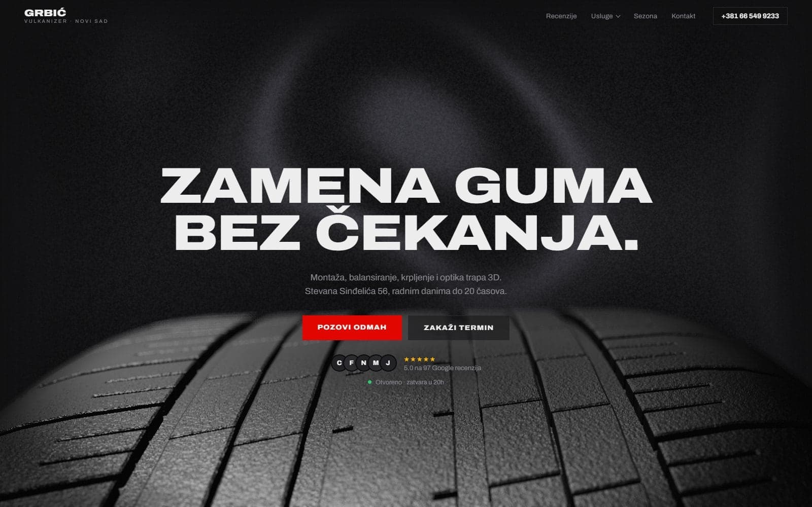
From the work: Vulkanizer Grbić
a site with a 3D tyre
A tyre shop and wheel alignment service in Novi Sad. The hero is a 3D tyre in smoke, the rest of the site leads to the phone number and a booking.
We design the screens your product lives on, from the first wireframe to a Figma file your developers can build without guessing. The work starts with how people actually move through the product: what they came to do, where they get stuck, and what gets them to the next step. You get an interface that reads clearly, holds up under real content, and hands off clean to engineering.
TIM Studio works from Novi Sad in Serbia, remotely, in English and Serbian, for companies in the UK, the EU and the US, and at home across Serbia, Croatia, Bosnia and Herzegovina and Montenegro.
What you get
User flows and a screen map covering the core paths, edge cases, and empty states, not just the happy path
Wireframes for every key screen, reviewed and signed off before any visual design begins
A high-fidelity UI design in Figma with a working component library: buttons, forms, navigation, cards, and states
Responsive layouts specified for mobile, tablet, and desktop, with breakpoints defined
A design system foundation: type scale, spacing, color tokens, and reusable components your team can extend
A developer handoff with annotated specs, named layers, and exported assets, so the build matches the design
How the work runs
Map the problem
We learn the product, the users, and the goals, then map the flows and screens before drawing a single interface.
Wireframe and agree the structure
We lay out every key screen in low fidelity so layout, hierarchy, and logic are settled before color and polish.
Design the interface
We build the high-fidelity UI and component library in Figma, covering real content, responsive behavior, and every state.
Hand off to build
We deliver annotated specs and assets, then stay close during development so what ships matches what we designed.
Before you ask
Both. UI/UX design sits inside our Web and App Development branch, so the same studio that designs the screens can build them. The design is made to be built, with components and specs that match how we code, which removes the gap where most handoffs break.
A Figma file with the full UI, a reusable component library, responsive specs for mobile and desktop, and an annotated developer handoff. You own the file and the design system, and your team can keep extending it after we are done.
Yes. We audit the current product, find where users drop off or get confused, and redesign the flows and screens that need it. You keep what works and we fix what does not, rather than rebuilding everything for the sake of it.
Write to us.